Shaping the look of online education

New marketing website design for SuperHi
Year
2020-2021
client
SuperHi
Role
Art Director + Designer
Services
  • Art Direction
  • Scalable Brand System
  • Landing Page Design
  • Graphic Design
  • Illustration
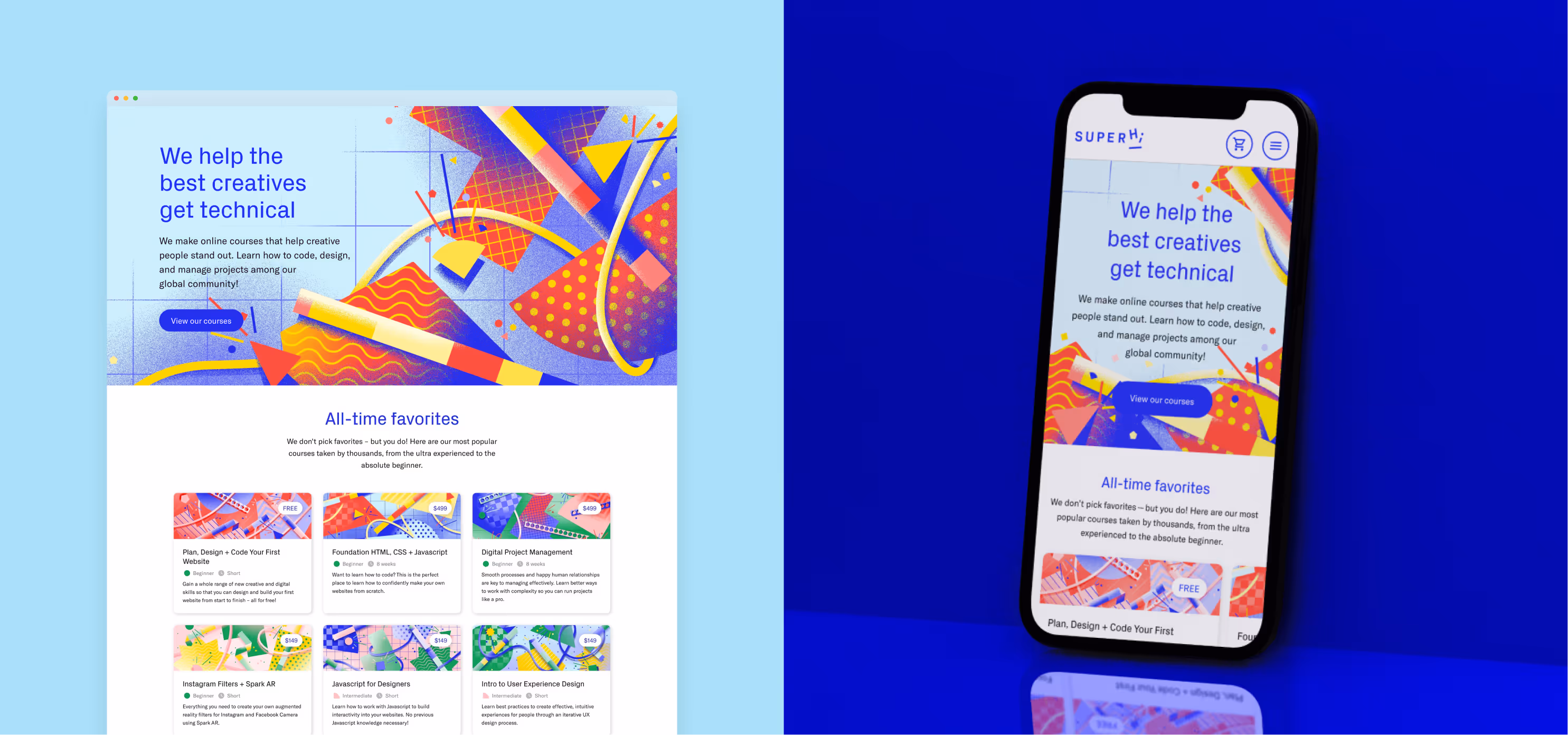
SuperHi is an online learning platform providing high-quality, accessible and on-demand education to creative people. Founded by Rik Lomas in 2016, they started out as a code school, but have grown to offer courses in code, design and project management, as well as tools and a thriving community that helps people worldwide expand their skills.
With a passionate community of coders, designers, makers, and learners, SuperHi needed a brand refresh and a revamped website to better represent their growing offering while solidifying their position within the competitive edtech space.
As SuperHi’s only designer (in a team of 8 people), I led the brand refresh, art directing the visual direction of the marketing site, creating 25+ course hero images, and designing lead generation guides—all built into a new visual and brand system.

Brand Audit

The team began by conducting in-depth research to understand SuperHi’s brand values, target audience, and competitive landscape. I’ve led the brand audit that served as the foundation for our strategic approach, allowing us to identify key opportunities to enhance the brand’s visual identity and messaging.
Snapshot of the old branding from SuperHi

Process

Following the brand audit, I facilitated a workshop to collectively define objectives and strategies for the brand refresh. Additionally, we conducted interviews with students to gather insights and feedback on their experiences with the platform.
Brand audit for SuperHi

Presentation

The presentation titled “Course Artwork: A problem, a discovery, and a system” proposes a scalable brand system for SuperHi. It was presented internally on July 26th, 2020.
Slide from the presentation for a scalable brand system for SuperHi.
Collection of the great feedback the internal team at SuperHi gave when seeing the proposal for a new visual system.
team feedback
SuperHi's team really resonated with the proposed brand new way to represent the courses.
A design system for the course imagery
All courses have two characteristics
in common: they belong to a discipline and have a level of difficulty. In the system, the discipline each course teaches is represented by the type of grid in the background and by the decorative elements in the foreground. The course difficulty is emphasized by the density of the background grid and by the number of shapes in the middle ground and their scale.
Visual design system for the SuperHi course images. Step 1: The background grid pattern relates to the course discipline and the grid density to the course difficulty.Visual design system for the SuperHi course images. Step 2: The number of shapes reinforce the course difficulty. Three shapes for beginner, four shapes for intermediary and six shapes for advanced.Visual design system for the SuperHi course images. Step 3: Example of the variety of shapes and patterns that can be used to compose the imagery.Visual design system for the SuperHi course images. Step 4: The last step shows the kind of finish touches to the imagery. These decorative elements vary depending on the discipline of the course.
Example of how the image for the "Foundation HTML, CSS + Javascript" course is used in a course card in the marketing site.
SUPERHI BUT FRESH
Foundation HTML, CSS + Javascript is the inaugural course of SuperHi and the cornerstone of the coding curriculum.
Course illustration for Experimental Typography for the WebCourse illustration for Digital Project ManagementCourse illustration for WordpressCourse illustration for React for WebsitesCourse illustration for Shaders for the WebCourse illustration for Intro to UXCourse illustration for Shopify Theme DevelopmentCourse illustration for Visual Design BrandingCourse illustration for iOS FundamentalsCourse illustration for Animation for the WebCourse illustration for Advanced ReactCourse illustration for Command Line for CreativesCourse illustration for Ruby on RailsCourse illustration for Intro to ReactCourse illustration for Intro to UI.
Whenever possible, there are little nods to the contents inside the course, hidden within the images. Here, the Creative Coding image references the position and transformative movement of the elements in one of the projects.
Course illustration for Creative Coding
Easter egg
Animated visual of squares rotating around a circle, produced by Guy Moorhouse
A project from the Creative Coding course, a close collaboration of SuperHi with Guy Moorhouse.

We wanted to create a fresh angle that would feel new to customers while retaining brand recognition. André worked closely with the team and existing customers to create a unique and engaging new brand that spanned all aspects of our business, from social media to product.

Profile picture of Rik Lomas
Rik Lomas
CEO and Founder of SuperHi

The Website

The new layered system that was created for the course images was expanded to encompass other touchpoints of the brand. It was important for the hero section of the website to feel different enough from the course images, while maintaining
a consistent identity and feel.
The result is bold, celebratory and builds into the visual direction.
A computer showing the brand new SuperHi homepage.
Ratio Mastery
Visual that explains how the old illustrations didn't adapt to the course cards, leaving huge white margins on the side.
Previous course images lacked adaptability across the various aspect ratios necessary for the website and other materials, as shown above by the vertical illustration producing white margins on each side of the course card. The new course images look great when cropped on any side and adapt to required formats effortlessly.
A collection of course cards, proudly displaying the new course images.Header section of the "Crypto + Web3 for Creatives" course, displaying in context how the course image is used in the marketing website.The students at SuperHi receive emails for each milestone of their course journey. In this image, an example of the very first (when they sign up) and the very last email (when they finish the course) they receive, featuring custom artwork.Collection of SuperHi course certificates.

Love letters from the community

Social Media

SuperHi’s new brand identity made a striking impact, capturing the attention of both existing followers and potential new students. Our link in bio clicks increased by 784% in 6 months, with a CTR of 97.0%!
Different examples of social media assets done for SuperHi
Example of two carousel posts that were published on SuperHi's instagram regarding the launch of the Intro to UI course and the behind the scenes with its teacher, respectively.
Schematic blue
Image depicting the transformation of the original course image into the blue and white schematic version for the behind the scenes collection of social media posts.
Course images were repurposed across various surfaces: Above, the Intro to UI syllabus mirrors the image’s background grid and color. Below, in a behind-the-scenes interview with the course creator, the image adopts a schematic, blueprint-inspired direction.

Welcome Pack

The exterior of the Welcome Pack box, with its gradient hues and subtle grain texture, embodies the essence of the SuperHi community’s diversity and inclusivity. The accompanying insert card extends a heartfelt welcome, setting the tone for an enriching journey ahead. Also inside, students will find a curated assortment of essentials, like sticky notes and washy tape, and fun items, such as an enamel pin.
Preview of the welcome pack. A postcard with a branded illustration can be seen along a rounded sticker that says Hi, using the company logo.The welcome card that comes with the welcome pack that is sent to new students

First Steps Guides

The First Steps guides are a lead generation and sales funnel content project. Their intent is to introduce people to SuperHi and their three main skill pillars, in a way that’s approachable, real, fun and practical, with a lens on helping people make and use these skills, no matter what role or career path they have or wish to have. This pdf series is derived from key articles from the SuperHi blog.
The covers of the three SuperHi First Steps Guides to Code, Design and Project Management, respectively.Preview of the SuperHi First Steps Guide to Learning to Code website page, showing the custom illustrations for each chapter.
12.3k
Downloads in the first three years across all guides

André displayed great attention to detail throughout the entire process, and was able to effectively align the content with our new SuperHi brand and marketing site, which he also creative directed. He’s an incisive and talented designer with not only an eye for detail and the skill to take any brief and make something with it, but the ability to think from the big picture and approach projects contextually and within fast-paced startup environments.

Profile picture of Ana Wang
Ana Wang
Former Head of Content at SuperHi
Credits
COURSE ARTWORK
  • Art Direction + Design
    André Cândido
Marketing Website
  • Art Direction + Branding
    André Cândido
  • Product Design
    James Shedden
  • Development
    Chris Lawrence
First Steps to Learning Guides
  • Author
    Ana Wang
  • Art direction + Design
    André Cândido
Social Media
  • Art direction + Design
    André Cândido
  • Additional Design
    Panna Nyeste
Welcome pack
  • Art direction
    André Cândido
  • Design
    Lauren O’Neill
Cover of the capabilities deck of André Cândido
For complete versions of the case studies, please request my capabilities deck.
Explore more work